We've been out in Switzerland trying out some new electric mountain bikes (more on that soon) but we also got to have a first go on Bosch's new display, the Purion.
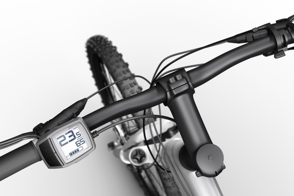
It's a compact display and control head unit that isn't much bigger than the current remote used with the Intuvia and Nyon displays, and it sits on the handlebars in the same position, by the left hand controls. There's two mode buttons, an on/off button on the top and and a walk assist button on the bottom.
The backlit LCD display shows the battery status, and the speed at the top. In between there's another data field. This can display power mode, range in current mode, odometer or trip distance. You can toggle between the displays with a longer press on the big minus button. If you have lights as part of your setup you can turn them on and off with a long press on the plus button, and there's an icon on the LCD display to remind you.
In use: simple and clear, but plus/minus buttons a bit fiddly
The display is basic, but it tells you everything you really need to know and it's simple to use. If the middle data field is set to anything other than the power mode, it will display the power mode briefly when you change up or down, then revert to whatever it was displaying before. The battery level indicator is a simple five bar graphic and it's simple to understand and seems to be pretty accurate, although one of our riding party was a bit surprised to find out that with one bar of battery left you only get a few minutes of power in Turbo mode! If you want to have a more detailed idea of how long your juice will last, it's best to be looking at the range.
My one main bugbear with the standard Bosch remote is that the plus/minus buttons are to sensitive: if you're resting your hand on the bars and you accidentally rest your left hand against the remote then you can find yourself switching modes by accident.
The opposite is true of the Purion: You'll never accidentally switch modes, but the plus/minus buttons are a bit fiddly: you have to get the press right, hitting the centre of the button, and the feedback, especially when you're wearing gloves, isn't great. More than once I found myself needing to move up to a higher mode and thinking I'd clicked the button, only to find I didn't have any extra power. Because the mode isn't necessarily displayed, it's not always obvious whether you've changed or not.
You get wise to the way the buttons work after a while, and it became less of an issue as I got more familiar with the display. Overall it's a useful addition to the Bosch system and it'll appeal to anyone who wants a cleaner, more stripped back look to their electric bike and doesn't need to be bombarded with data. Given the size of the Purion display I'm a bit surprised that the decision wasn't made to always show the current mode, it'd be easy to do without taking much space from the rest of the data fields. A simple segmented bar along the top would do it.


